As we get closer to the new year, we can’t wait to see which graphic design trends lead the way in 2018. Each year, design trends play a subtle yet important role in marketing. Some trends come and go, while others continue to evolve each year in new and inspiring ways.
While we never advise following any trend blindly, it can be useful to stay abreast of trends to get inspiration for the year ahead. Keep reading to find out which 2018 graphic design trends are worth noting.
Graphic Design Trends to Watch in 2018
Some of our favourite graphic design trends to watch in the new year include the following:
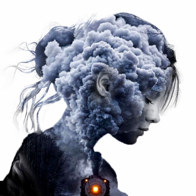
· Double exposure. This trend has stayed current for a number of years. Next year, we are sure to see even more use of double exposure in brochures, business cards, flyers, posters, and various other materials. There are many ways to bring double exposure elements into your designs. One way is to use alternating shapes to add contrast. You could also use images in different colours to further add impact. However you use it, this look is bold, interesting and eye-catching.
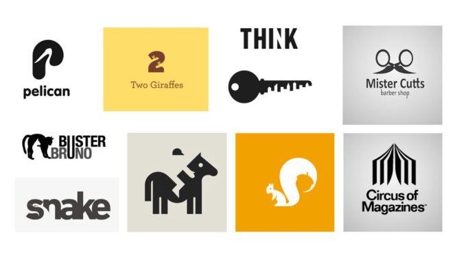
· Negative space. Negative space is very similar to double exposure, with a few key differences. Rather than juxtaposing two images together in one design, spacing is used in a way that creates brand new designs from existing elements. This can be especially powerful when used in logo design and poster design. Choose your fonts wisely to get the full effect of this trend. On the topic of fonts, there are some noteworthy trends in typography as well in 2018…
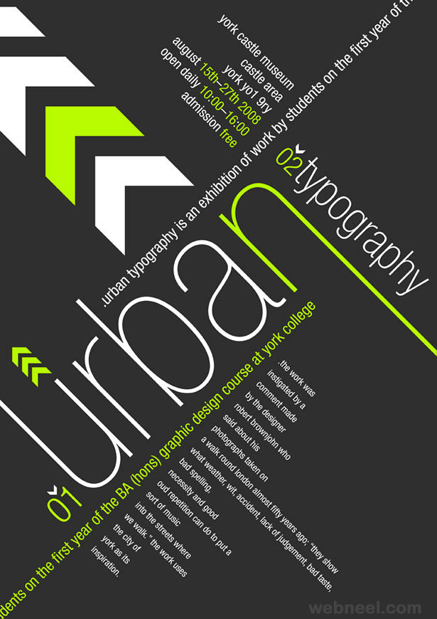
· Creative typography. Typography remains one of the biggest design trends, year on year. In 2018, we can expect to see a number of interesting, creative font trends. One of the biggest trends will be handwritten fonts, which work especially well with hand-drawn illustrations. This look is ideal for brands wanting to add a personal touch to marketing material. It is light-hearted, fun and quirky, while also being fresh and original. Depending on your goals, you can use creative fonts in brochures, posters, flyers, door hangers, and various other material.
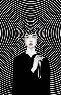
· Artistic illustration. Continuing the hand-drawn effect, illustration continues to be used in a range of posters, logos, business cards, and brochures. One of a kind graphics can be a fresh way to add impact to your branding material in a way that is approachable and memorable. Illustration can be layered over photographs, integrated within or around fonts or even repeated to create interesting backgrounds.
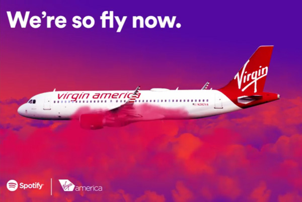
· Colour gradients. Next year, it is time to say goodbye to flat colour, and hello to 3D colour and other visual effects. Colour gradients are one of the top colour trends to watch in 2018. This trend will be used in a range of ways, from website backgrounds all the way to printed brochures, posters, business cards, and other material. If you plan to use this trend, be sure to choose your colour gradients wisely so that they blend into each other without clashing.
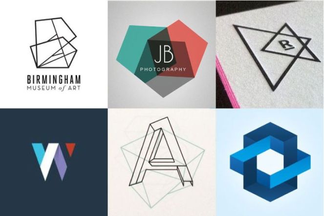
· Geometric shapes. Geometric shapes are also on the rise. These can be found in logo designs, as well as backgrounds, brochure layouts, posters, and various other printed sales material. Use this trend sparingly so that you are able to highlight information rather than distract the eye. When used in moderation, geometric shapes add a touch of retro style to your material. When used too much, however, the result will be more distracting than interesting.
Looking for a way to keep your marketing material on trend? Get in touch with the Minuteman Press Pinetown team for the very best in graphic design trends in Durban and surrounds.
