This page fully explains the requirements that printers need to ensure a good quality print, incorrectly supplied then your product will come out the wrong size, information cut off, white stripes on the sides instead of your coloured background design to the edge, blurry / pixelated prints that look all jagged and not smooth/clear text and so forth.
Below explains how to setup the sizes, the safe zones, the bleed area, the quality of the file saved and tips from clients supplying artwork from free sites like canva and ai, which is not designed to be print ready unless you pay for their subscription for the full professional versions, then a high quality file is produced to the industry standard.
Free designs comes at a cost, it means it looks great but its not the best quality and will print that way.
We can always assist in designing your artwork for you, at a fee of R390 excl VAT per hour, or part thereof to ensure that it is print ready and of high quality, however we try advise our clients as best we can to produce the correct artwork themselves as its more cost effective for them, but they will need to follow the below guidelines and requirements for us to guarantee the printing we produce from the files supplied. Should the below not be achievable with the method they have designed the files, then the client must confirm that they are aware of the issue(s) with the artwork supplied and that we won’t be responsible for the printing supplied.
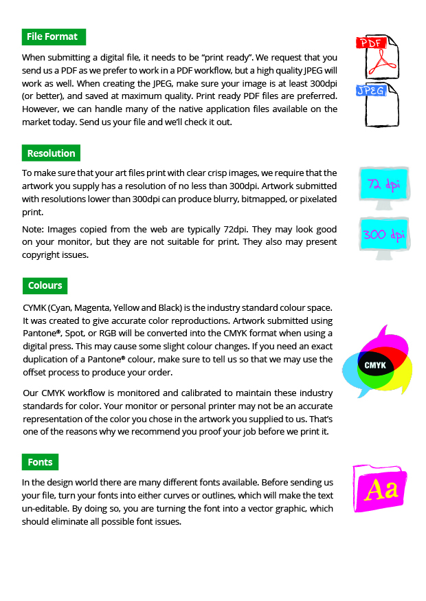
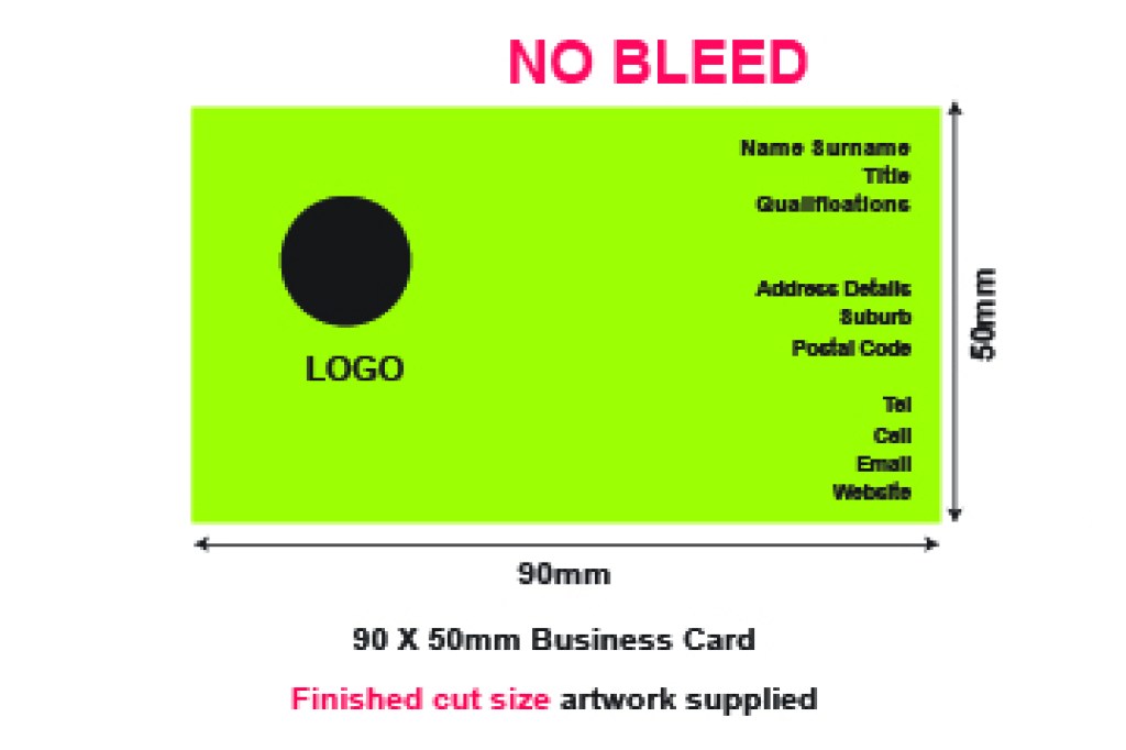
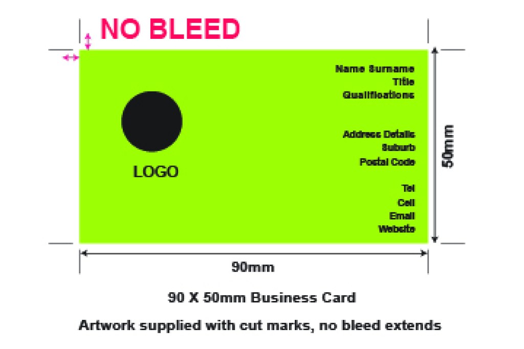
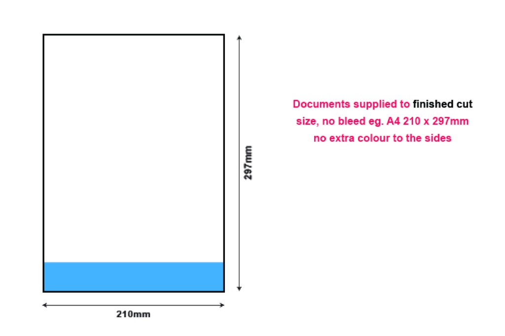
PRINT READY ARTWORK MUST SUPPLIED IN PREFERABLY IN VECTOR PDF FOR OPTIMUM PRINTING QUALITY, ALTERNATIVELY 300DPI RASTER IMAGES, WITH BLEED, TO THE EXACT SIZE REQUIRED FOR PRINTING.
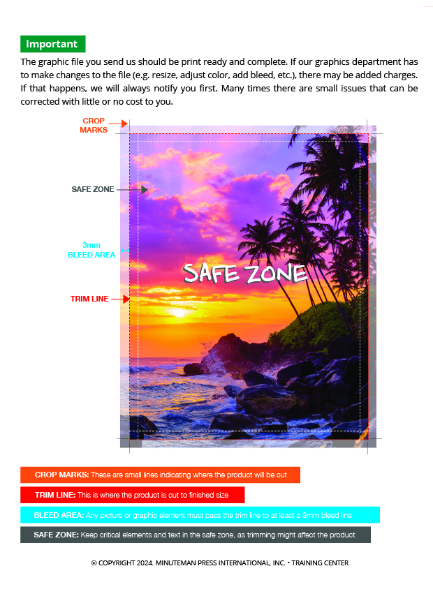
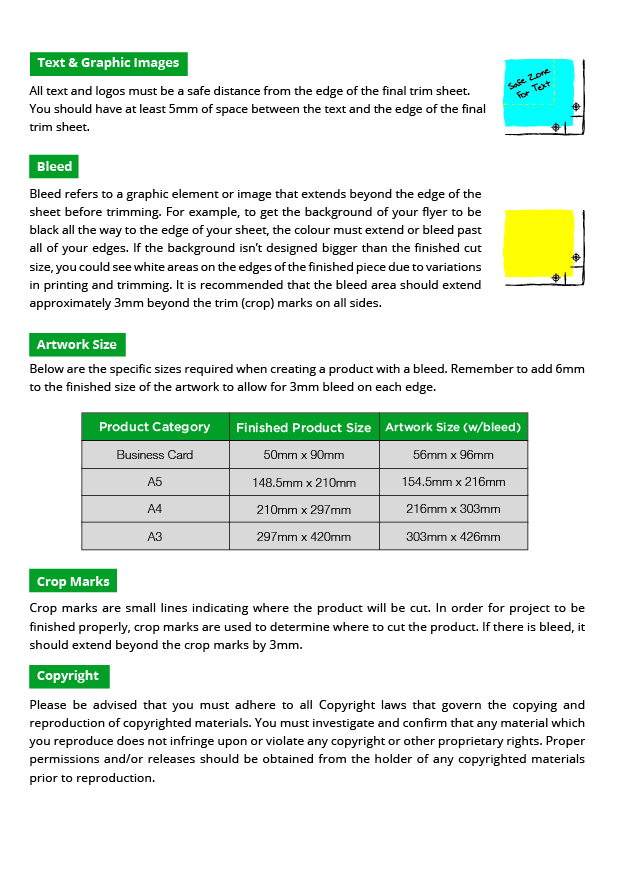
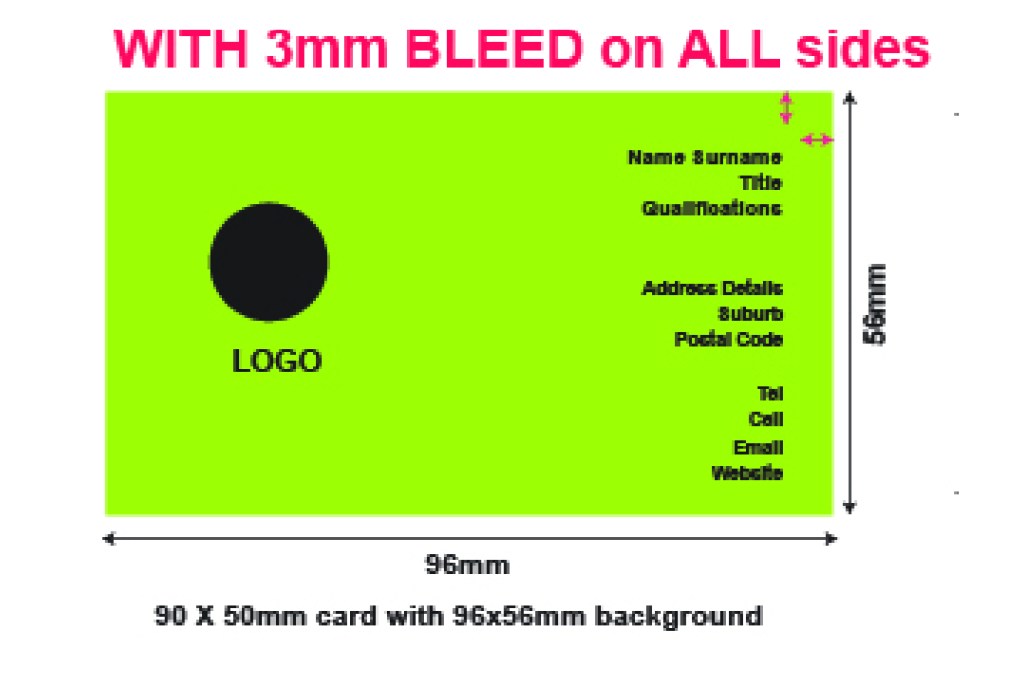
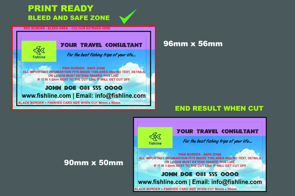
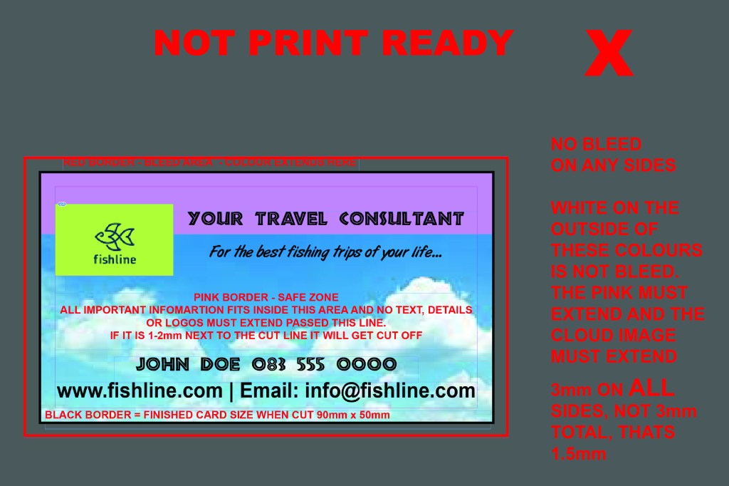
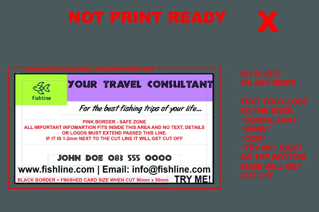
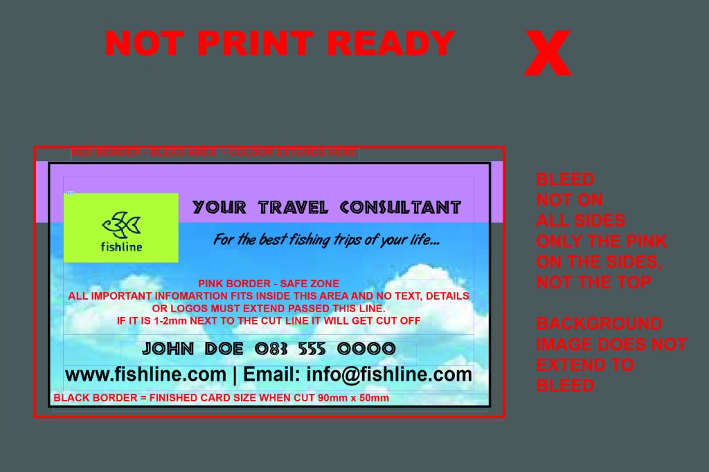
MOST IMPORTANT REQUIREMENT IS BLEED –
(Colour extended passed the actual finished cut size).
This ensures your colour prints to the edge of the paper, due to movement in the machine, if you have your artwork EXACTLY to size and it shifts, then when we cut you will get white stripes on the side.
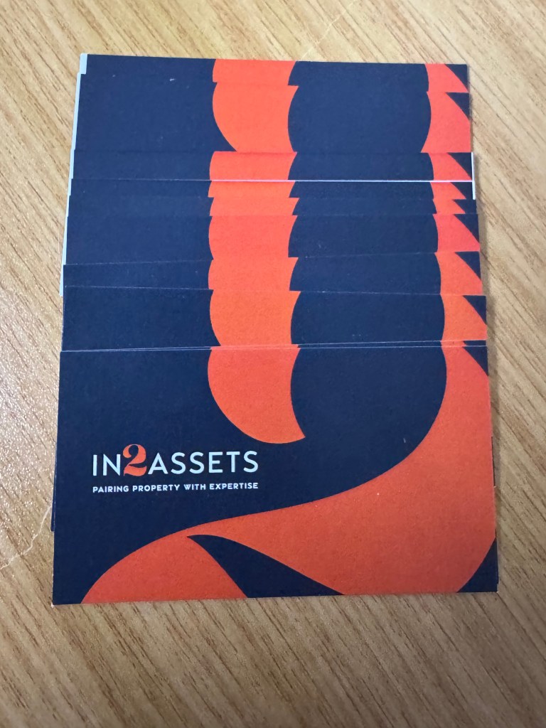
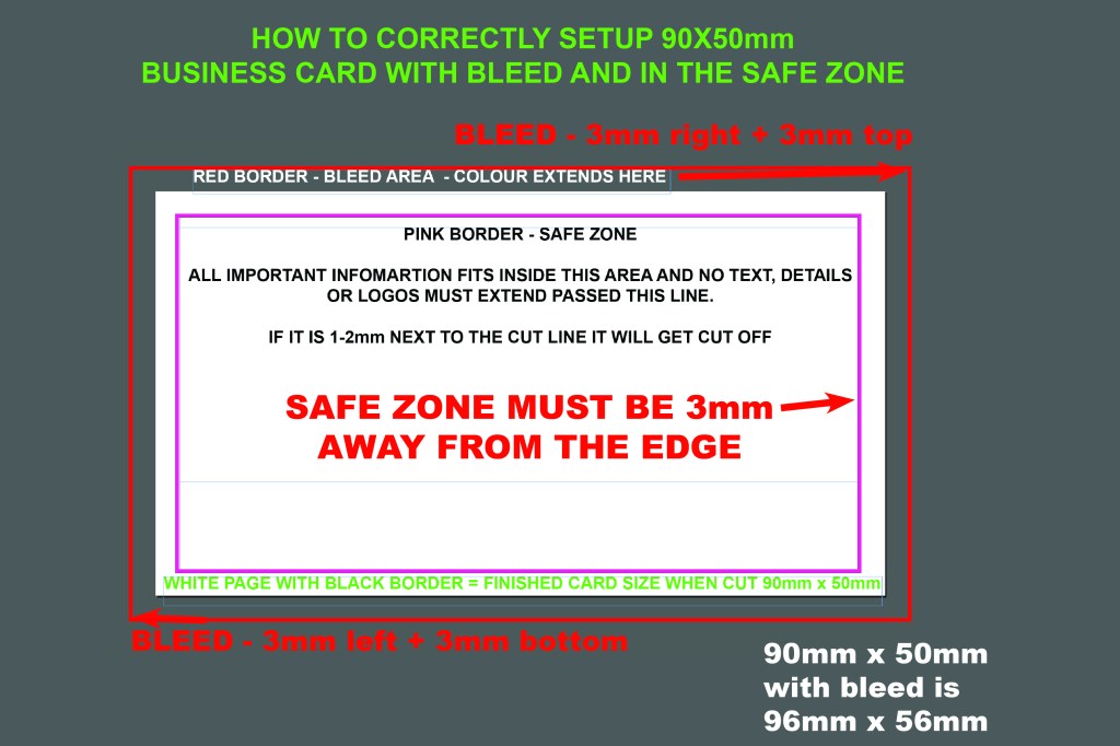
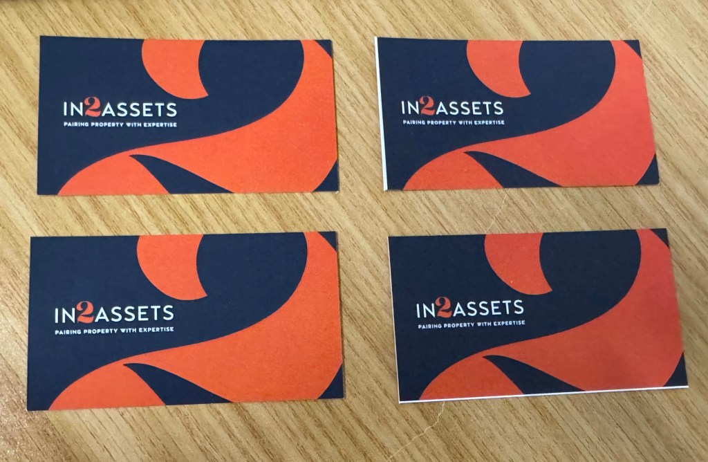
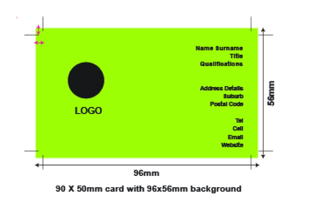
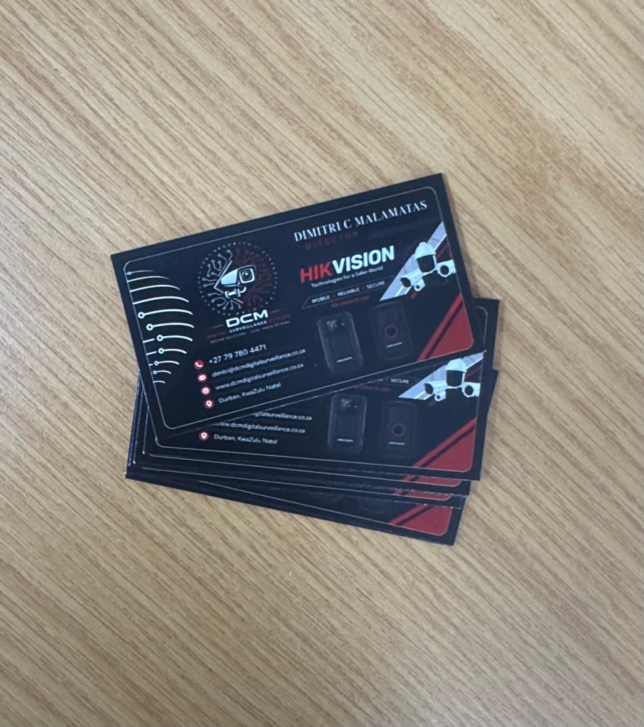
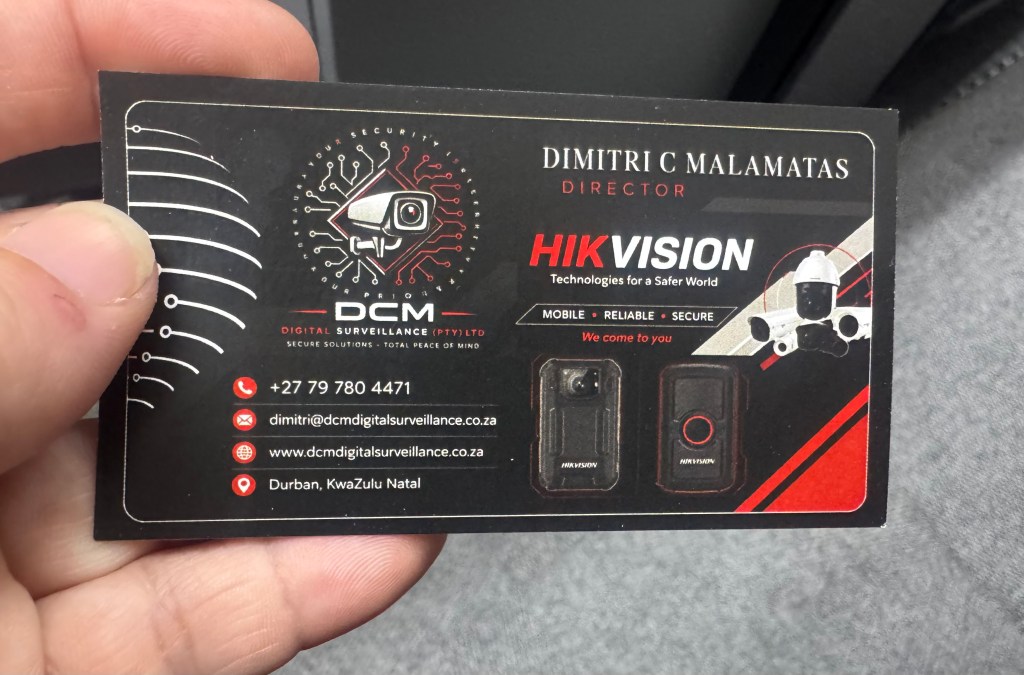
See below cards cut that had bleed (top) and the cards that didn’t have bleed (bottom) which ends up with a white stripe instead of the background colour reaching the edge of the card.
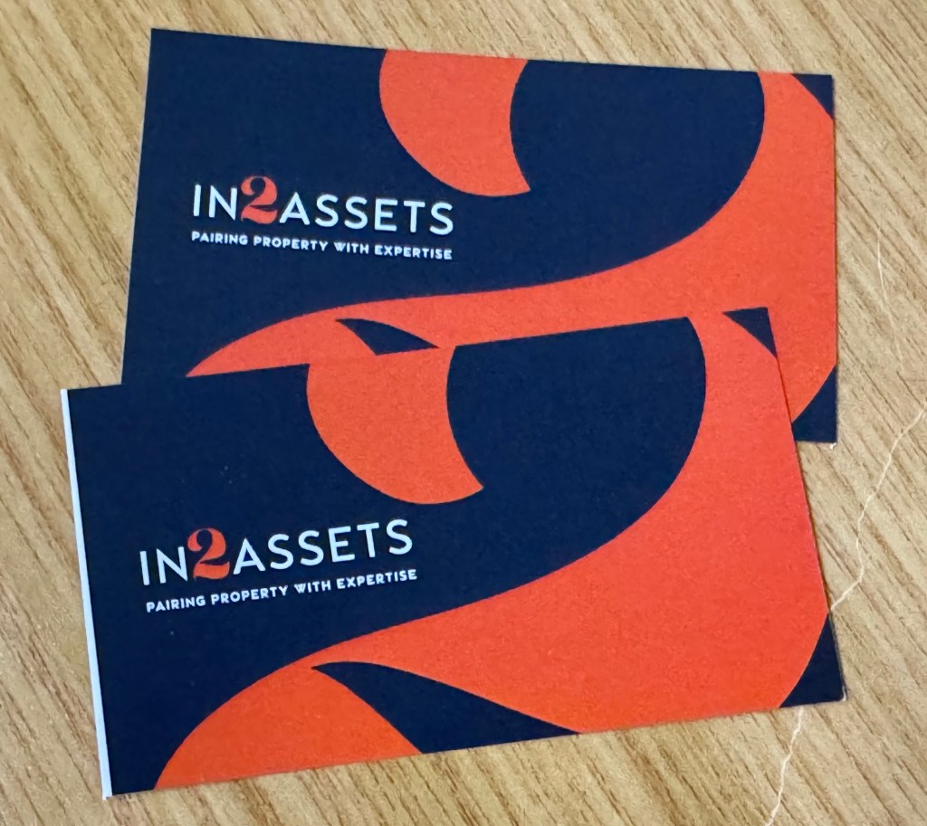
THE RESULT OF CARDS WITH BLEED VS NO BLEED
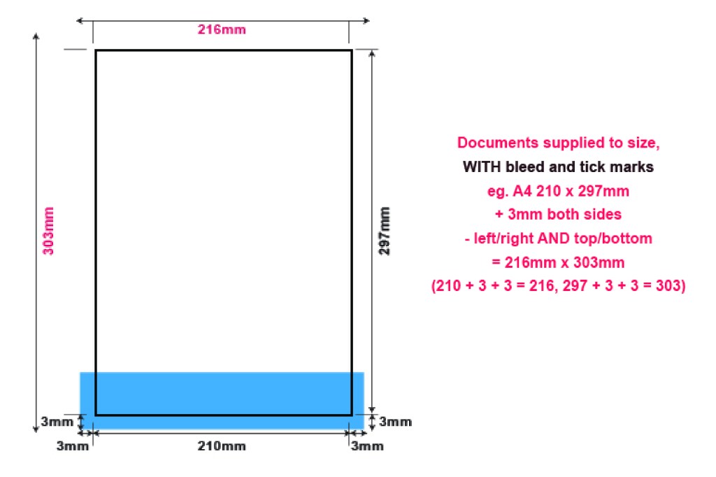
A white stripe coming from the white paper will appear. The colour must be extended 3mm passed the cut line on all sides. This makes a 90x50mm business card have artwork 96mm x 56mm (3mm left + 90 + 3mm right = 96mm).
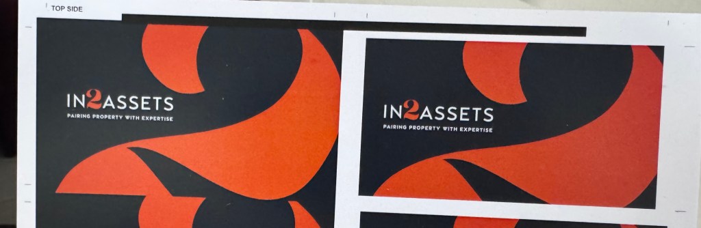
See below the difference in the printing with bleed (left) compared to printing without bleed (right)
The white spaces need to filled / extended / bled out the surrounding area on the white page with the background/design/images in your design so that there will still be a background instead of just the white from the white paper when there is movement in the machine. Thus bleed can not be white, in this design example it must be the black and the orange from the number 2 design.
WHEN SAVING YOUR ARTWORK FROM CANVA
Click the download option and change it to pdf and then make sure the bleed and crop marks is selected. See below
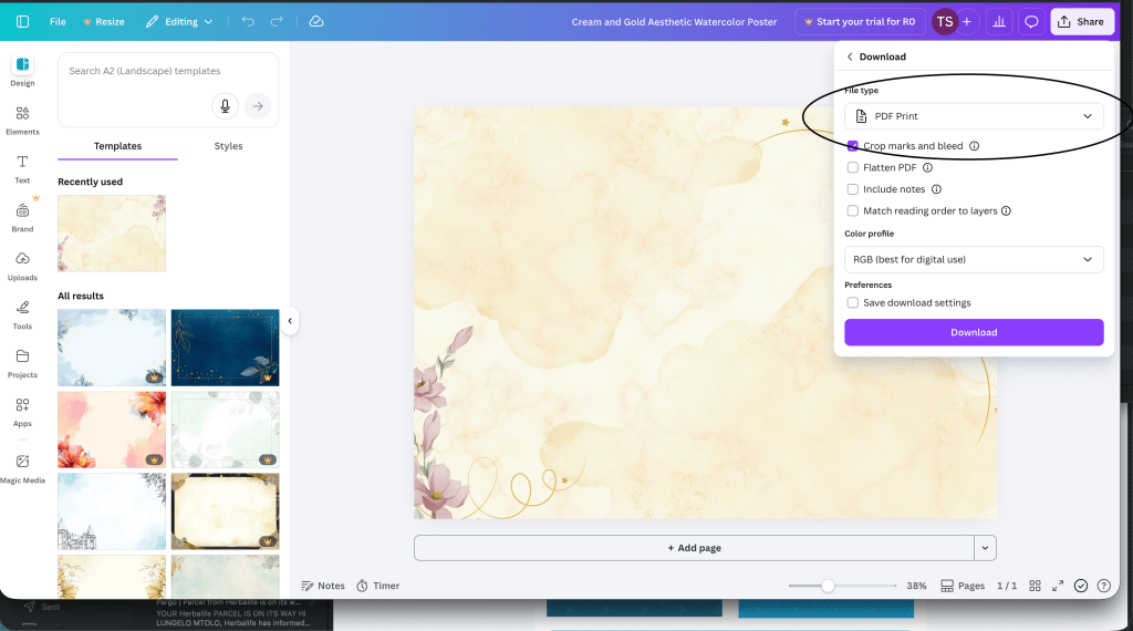
As canva is a free service for designs and templates, many dont realise its actual free service is for basic designs or advertisements. It does NOT offer anything free that is for the printing industry. This is where they require subscriptions to firstly download pdf file and not images, however you can download a FREE PDF DOCUMENT (digital), it is NOT print ready at all. This is a document for emailing or uploading on a website and does not conform to printers requirements.
To download the printers required PDF it will have a star and say you must subscribe. The required download should be :-
1 – PDF Format
2 – Contain Tick marks & bleed
3 – Must be in CMYK format (Only RGB options is free, this is for screens as screens display RGB and will NOT guarantee your printing colours and quality and may even convert from a yellow to a green/blue tint for example)
4 – Flattened pdf is even better, as there will be no issues with fonts or layers printing odd on the printer and you end up with white blocks instead of an object that is supposed to have a transparent background on a background colour.
We do not subscribe to Canva, as we use Adobe design software suite, thus we can not edit your canva files or download them for you. If you supply a file from canva, we can not guarantee the printing.
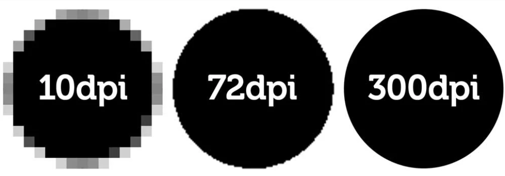
QUALITY SAVED IN YOUR FILE IS THE QUALITY THE PRINTERS WILL PRODUCE.
IF YOU ONLY SAVE A 72DPI FILE MEANT FOR EMAILS AND WEBSITE, IT WILL PRINT PIXELATED.
Do not make your text too small, it will be unreadable when printed
While your design may look great and readable on the screen, keep in mind the actual size it is going to be printed, especially when you have a background colour. The colour will “fill in” much like you can imagine a stamp doing so with ink, blotchy and taking away the clear definition of your text and font. This is particularly the case with black backgrounds as that will absorb all four ink colours – cyan, magenta, yellow and black, leaving very little space for your white text.

Ensure your text is never 1mm or small, in laser printing that is the absolute smallest it can go but its not guaranteed to be readable as it depends on the colours its printing, the background it appears on and the font you have used.
Never fill your design with too much information that your force your most important information to be too small and unreadable.
Zoomed in you can read it and see all the detail you would have seen on the screen however not very clear. Always keep this in mind when designing your artwork, for instance a business card is only 50mm in height, 5 lines of text is already 10mm in height, if you have 10 lines of information then you now at 2mm in height. Ratio, sizing and proportion is very important, as well as spacing. Keep your designs neat and presentable. The old expression “less is more” is always a guide and rather keep the most important information displayed followed by a reverse side that could contain any additional information.
Ink jet printing for vinyl stickers sprays inks and will fill the ink even more on the substrate, making it very hard to read and your label useless if the information relayed to your customer is of no use to them.
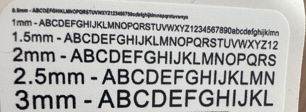
The above is text printed on vinyl label but zoomed into the size and as seen 1mm is the absolute smallest you should go on your text.
What Colour profile to use on your artwork and does it matter?

If you’re preparing designs for print in Kloof, knowing the difference between CMYK and RGB colour modes is essential. Colours that look perfect on your screen don’t always translate well to printed materials, and this usually comes down to whether your artwork is set up in CMYK or RGB. In this post, we’ll break down everything you need to know about CMYK vs RGB for printing so you get flawless results for your next project.
H2 – What is RGB?
Let’s start with what RGB is. RGB stands for Red, Green, and Blue, the primary colours of light used in digital displays like monitors, smartphones, and tablets. This colour model creates images by mixing these three light colours in various intensities, resulting in vibrant, glowing colours that look brilliant on screens.
RGB is perfect for anything intended to be viewed digitally, from websites to social media graphics. However, RGB isn’t designed for printing because it relies on light emission rather than ink. When you send RGB files to a printer in Kloof, the colours often come out duller or slightly off compared to what you see on screen.
H2 – What is CMYK?
Now, what is CMYK? CMYK stands for Cyan, Magenta, Yellow, and Key (Black). This is the colour model used in printing, where inks combine in layers to produce the final image on paper or other materials.
Unlike RGB’s light-based system, CMYK uses subtractive colour mixing, where inks absorb light to create different shades. Because of this, CMYK colours tend to be less bright but are more reliable for print. For businesses and creatives in Kloof, working in CMYK or converting your files before printing ensures your materials come out with accurate, consistent colours.
H2 – Difference Between RGB and CMYK
The core difference between RGB and CMYK is how they produce colour and their intended use. RGB is an additive model, designed for digital screens by combining coloured light, whereas CMYK is subtractive, using inks to absorb light and display colour on physical materials.
This technical distinction means the difference between CMYK and RGB printing is significant — colours that appear vibrant in RGB often lose their brightness when printed in CMYK. That’s why it’s crucial to preview and adjust your artwork in CMYK before sending it to print.
In Kloof, where local businesses rely on professional print materials to make a great impression, understanding the difference between RGB and CMYK colour can save headaches, reduce waste, and guarantee your marketing collateral looks exactly as planned.
If you’re unsure which colour mode to choose or need help preparing your artwork for print, Minuteman Press in Kloof is ready to assist you. We’ll guide you through the CMYK vs RGB for printing process to deliver outstanding, true-to-life colours every time.
WHEN SUPPLYING FILES DESIGN BY AI / CHATGPT
Chatgpt will design flyers or social media posts that look great on the design but they are NOT designed to be print ready artwork with high quality images, nor does it have vector artwork and text. This means it’s all one big picture that is a very LOW quality picture as your phones and computers only need 72dpi on the screen, whereas printing requires 300dpi for clear quality prints. If you do not tell ai to make your artwork 300dpi and print ready with bleed, it will just create a simple image for you to use.
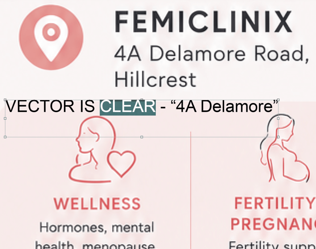
We can not use this artwork for printing and will not be able to guarantee our print quality as the artwork quality is poor, compared to a high quality vector pdf where the text is actual typed text and not pixels (raster images like a photo) as seen in the difference below with the address in the image compared to it actually being typed in a design program.
Ai will also not save your artwork with bleed as mentioned above in our requirements and therefore your printing will not have the extended bleed artwork and most likely have information that will end up being cut off when trimmed. See example below of ai artwork supplied not to the correct size of an A5 flyer, leaving white space on the sides and the bleed area not filled in.
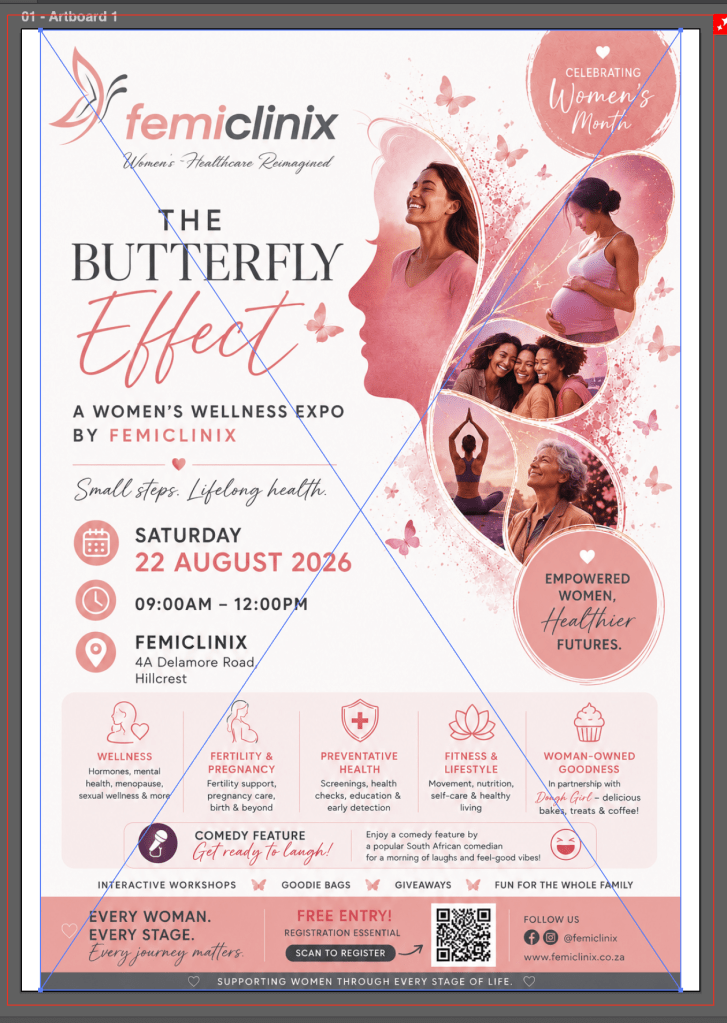
All we can do is scale it down smaller than an A5 and fill the rest of the flyer and bleed with ONE colour at no charge. The darker pinks and grey will not print to the edge, nor will it have bleed. Additional requirements to fix that will incur a design fee.
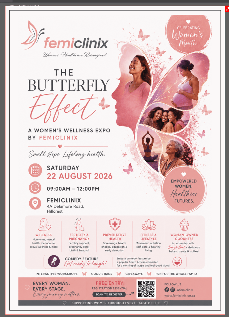
Here is another example of a flyer created with ai that we simply added one colour for the flyer for printing to make it A5 size and to have some bleed and not white stripes on the edges.