
Helping you ensure the very best level of quality for your printed material, these pre-print design tips are made especially for those running a small business. As a business owner, presentation is everything. Your marketing material is an extension of your brand, helping to close deals, increase leads and grow your business. When your marketing material is less than expertly designed and printed, the message it can send is never ideal. Poor quality brochures, business cards, flyers and posters look amateur and unprofessional.
To ensure that you send prospective clients the right message, these pre-print design tips are sure to give you a better idea of how to perfect your project before they go to print.
Pre-Print Design Tips for Perfectly Printed Marketing Material
Some of the most important pre-print design tips to ensure that your projects are professionally and expertly prepared include the following:
Proof carefully to avoid errors.
Grammar and visual proofing are both essential to ensure that no errors slip through the cracks. As a business owner, the last thing you want is promotional material that contains errors. Even the smallest oversights can make the difference between closing a sale and losing a customer to your competition. Negative user experiences have a direct impact on your sales, brand and reputation. Typos, spacing issues and other errors can all affect the way that potential customers see your business. It is not always as easy to make changes after your projects have gone to print. This means that you will need to catch any potential errors in advance, before sending your files to the printer. The two main types of proofing include wording (the actual text on your brochures, flyers, posters or even business cards) and visual (the overall spacing, layout, words that are split between line breaks and other inconsistencies in the design).

Check font spacing.
You will also need to pay special attention to the spacing of the font you are using. This means adjusting the leading, kerning and tracking of text if the font is not spaced correctly. Every single paragraph, letter, punctuation mark and negative space needs to flow cohesively in a way that makes the text easy to read. Text should stand out for all the right reasons, and not because it is hard to read, not aligned properly or off in any other way. This will help to ensure a flawless visual experience that ensures optimal results from your brochures, posted, business cards and other sales material.
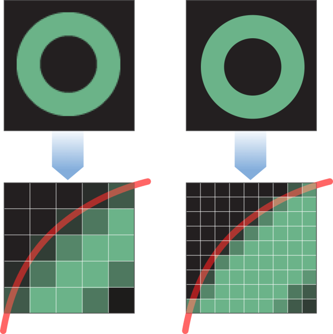
Confirm image size and resolution.
Be doubly sure that your image resolution and size is correct. Check the resolution of the images you have used in your design, as well as the resolution of the entire project file. Ideally, print ideals need to be saved at a minimum of 300 DPI. A good rule of thumb is saving your files at the highest resolution possible. Remember that you can always reduce the size of the file, but you cannot easily increase the size without losing clarity and detail. Be careful not to enlarge images more than 20% of their original size. Changing images in your document will affect the final resolution of your entire file as well.
Ensure colour accuracy.
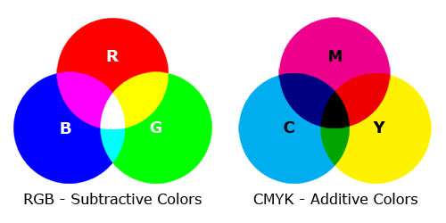
Another thing to check is colour accuracy. In our guide to design and printing colours, we give a detailed overview of what each colour is used for during design and printing. The colours you see on screen are not always the same as the colours you will see in a final printed design. It is very useful to check the existing colour to be sure that it will print accurately. Most designs are in RGB colour, while most printers work in CMYK. Make sure that you set your programme to CMYK so that you can be sure that your colours print accurately.
Define bleed and crop marks.
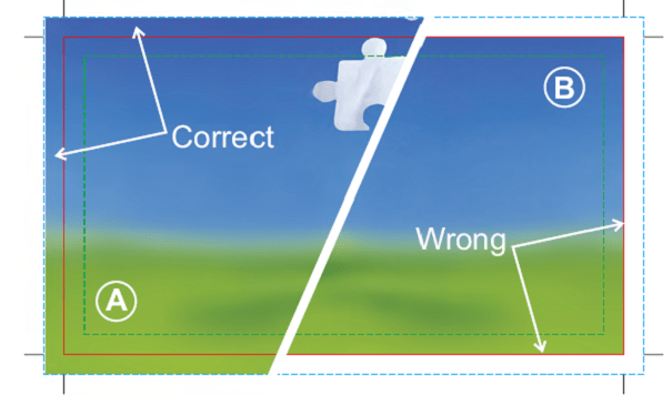
You will also need to be very clear that your bleed and crop marks are correct. These marks indicate the edges of your final design, showing where cuts will be made once the file is printed. Crop marks show exactly where designs will be cut, while bleeds indicate parts of text or graphics that extend beyond the page boundary. Outside the bleed, there is a slug that includes printer instructions, additional print info and other important information required to print. Ignoring the bleed might end up causing a white border on the side where physical paper extends past the design.
Check the preferred format your printer requires.
Finally, it is always useful to know which format your printer prefers files to be sent in when submitting design work. Some printers prefer PDF documents, while others may accept InDesign files or PSD files. Make sure that you know which format is preferred so that you can simplify the process and avoid potential incompatibilities.
For assistance with high quality design and printing in Durban, get in touch with Minuteman Press Pinetown today. We will assist with all the expert help and pre-print design tips you need to craft the very best material for your business.
