• Want to market your business in Pinetown? Print flyers!

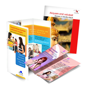
    brochures


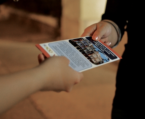
    Renowned printing company, Minuteman Press in Pinetown, often gets tasked with printing everything from banners and business cards to invites and catalogues. Flyer printing, however, is still one of the best ways for business owners and marketers to get the most bang for their buck. Here are a few advantages of using flyers for your advertising:


    • Cost-Effective

    Many printing companies, including Minuteman Press in Pinetown, offer in-house flyer design services. Saving on graphic design and hiring an affordable printing company means that your flyer marketing campaign won’t cost you an arm and a leg. If you’re looking for a cost-effective, high-impact marketing solution, then flyer printing is it.


    • Raise Brand Awareness

    In today’s day and age, most people hop online to find the products or services they need. There could be many people in your vicinity that need the solutions your business offers, but they simply aren’t aware of your company, and they might not be finding you online. A simple flyer campaign is a great way to introduce your company to more people and raise your brand awareness.


    • Strategic Marketing Initiatives

    If you know that you want to target people in a specific location or in a specific age group, then flyer printing is the way to go. Instead of investing in a print ad in a magazine that could or could not get seen by your potential customers, you can choose exactly where and when you are going to distribute your flyers.

    Marketing-Your-Small-Business-With-Brochure-and-Flyer-Printing


    Contact us for flyer printing services in Pinetown today.

  • The Power of Promotional Products

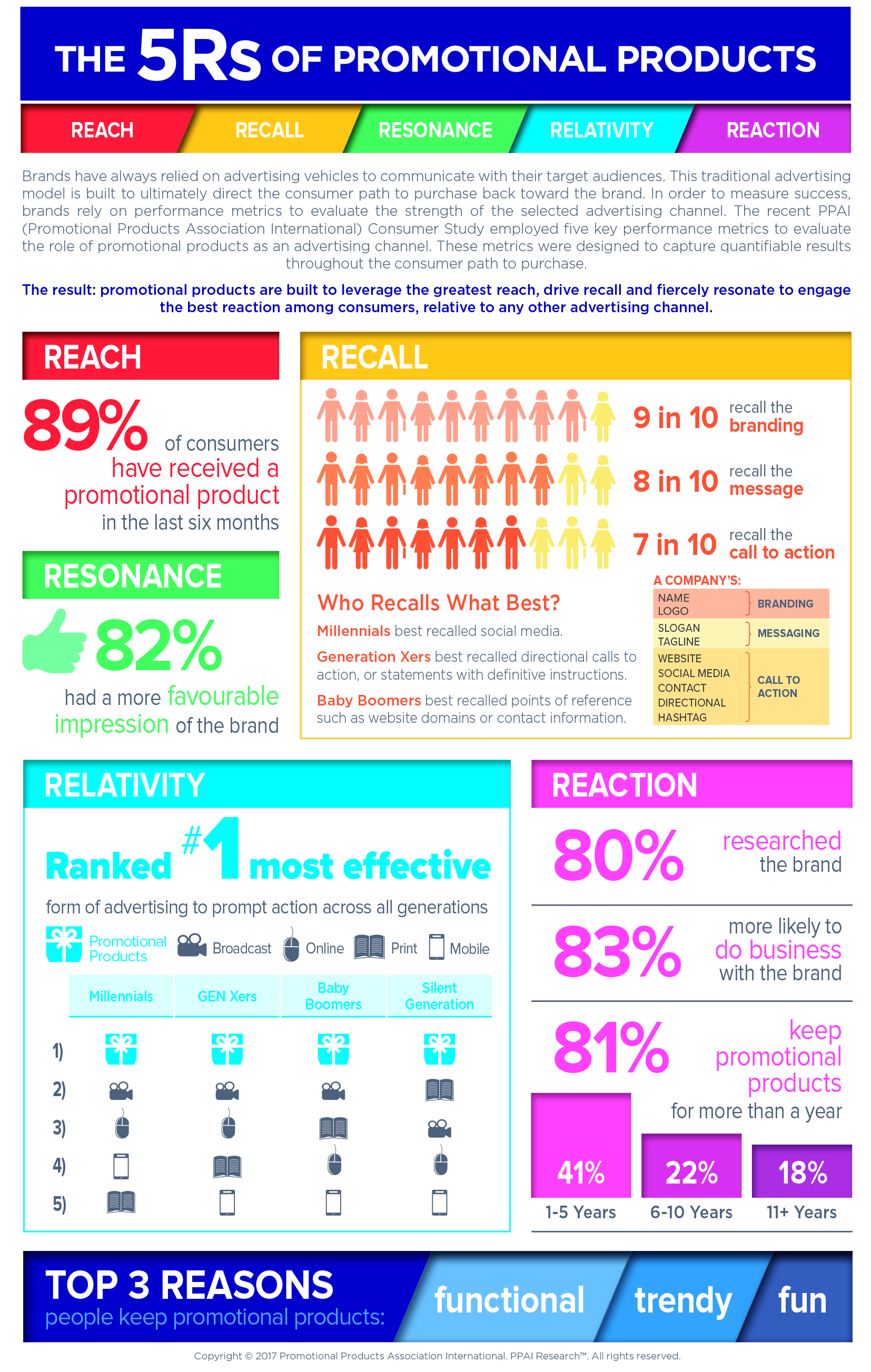
    Promotional products can have a powerful impact in your marketing strategy where you are wondering if you are reaching your target audience. Do they recall seeing your brand? What is their impression of your brand? Is your services relative to the customer’s needs? Will they react to your marketing campaigns?

    The infographic below demonstrates the 5R’s which result from distributing promotional products to your target audience.


    Power of promotional products

    If you would like to reach your target audience, get them engaged and have them react to  a need which you can fulfill, then contact Minuteman Press Pinetown for a variety of promotional and corporate products which can be branded with your company logo, name and telephone number.

  • Paper Types FAQs

    Paper Types FAQs

    paper_fan


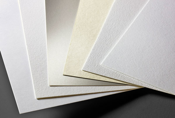
    To help you get a better idea of how paper is chosen for various projects, we have put together some simple paper types FAQ. These questions cover some of the basics, from the differences between coated and uncoated paper to short and long grain, absorbency and weight. Remember that these paper types FAQ are here to act as a guideline. Should you have any questions at all, please get in touch with our team for assistance. We are always happy to give you advice on choosing the right paper for your needs.

    Stay Informed With Our Paper Types FAQ

    For the meantime, the following paper types FAQ will help you stay informed on the basic qualities and uses of paper in the printing process.

    What is stock?

    Stock is a term that refers to the material used for printing. It could refer to paper used for brochures, flyers or posters, or thicker card used for business cards and postcards, for example.

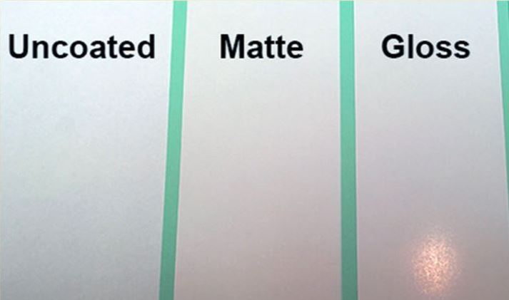
    What is the difference between coated and uncoated paper?
    paper-type

    Coated paper has a coating that gives it a smooth finish. This could include a gloss or satin finish. Usually, coated paper is the best choice for projects that require a high quality finish, such as flyers and brochures. Uncoated paper has no coating. It is not as smooth, but it works well for paper material such as letterheads, envelopes and some business cards.

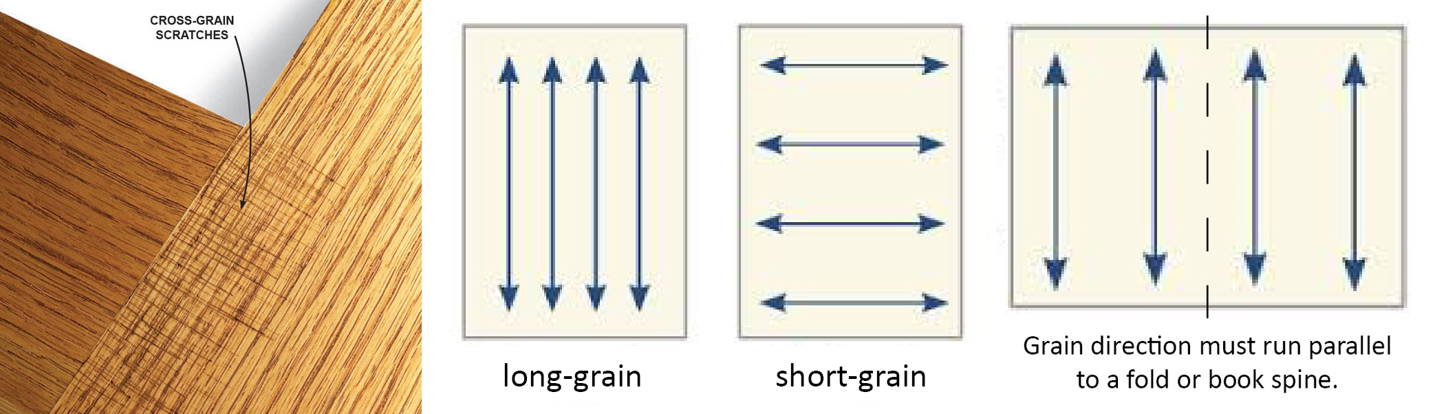
    What is long grain and short grain?

    Long grain is used to refer to paper that has a longer dimension that runs parallel to the grain. Short grain refers to paper that has a shorter dimension running parallel to the grain direction.
    grain-direction-1

    What is meant by absorbency?

    This term refers to the capacity that paper has for accepting fluid, such as ink. This could affect how well the paper holds its colours and detail after printing. A very absorbent paper has a bolder effect, while less absorbent paper may not be quite as bright.

    What is the difference between 100gsm, 120gsm, 130gsm, 170gsm, 300gsm, 400gsm and 450gsm?

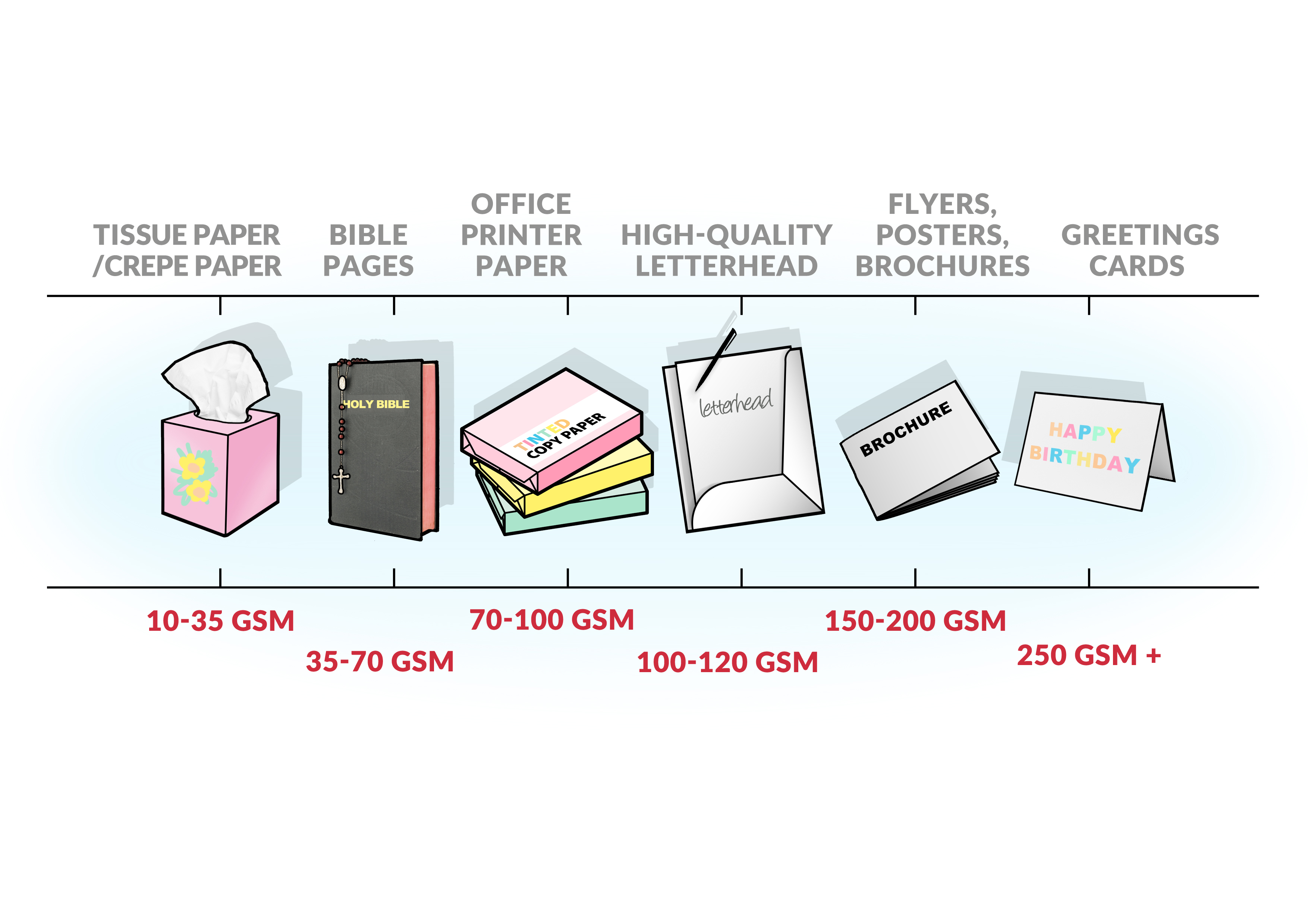
    All of these measurements refer to the weight of the paper. Paper thickness is measured in grams per square metre (gsm or gm). Fax and regular photocopy paper have a weight of about 80gsm, while a premium letter may be between 100gsm and 120gsm, a leaflet or  a flyer may be 120-170gsm, brochures and company profiles around 200-300gsm, and a postcard or business card around 280-350gsm. Packaging and boxes need to be sturdier to hold the products without it falling out or the boxes tearing, thus these will be 400-450gsm board.

    Uncoated paper can seem thicker than coated paper, due to the fact that uncoated paper does not have a coating on, which takes up most of the weight, thus coated paper has more coating and less actual paper pulp, making it appear thinner or more flimsy but they are infact the same weight as the uncoated stock.

    Generally speaking, the weight of a paper is a good guideline to indicate the thickness of the paper. We will always advise on the best weight for your project – speak to our team if you are ever in doubt.
    Paper-chart


    What paper should I use for my project?

    Every project is different, with different paper requirements. The best way to determine the best weight, finish and coating for your project is to simply ask when submitting your initial enquiry. That way, we can advise you on the best paper to suit your specific needs. This, in turn, will ensure the best results.

    Get in touch with the Minuteman Press Pinetown team today if you have any more paper types FAQ or let us know if you have any other questions you may have about printing services in Durban and surrounds.

  • 2018 Printing Trends

    2018 Printing Trends

    print-marketing-trends-2018-chilliprinting

    As we get a bit further into the new year, these 2018 printing trends are showing just how much the print industry is set to adapt over the course of the year. Each year, a number of trends help to continue the consistent evolution of print as a medium. This year, we are looking forward to a number of trends that will shape the industry, from the increased fusion of print and digital to colour trends, texture trend, personalised direct mail campaigns and new trends in large format printing.


    Keep reading to get our insights into the biggest 2018 printing trends to watch this year, so that you can get inspired for your upcoming campaigns.


    2018 Printing Trends to Watch


    Some of the most interesting 2018 printing trends to keep an eye on this year include the following:


    Print and digital fusion

    The lines between print and digital have continued to blur, resulting in an increased move towards fusion in 2018. Many businesses incorporate social media addresses on their business cards, while other businesses drive engagement through audience interaction with printed materials. If you are not keeping both print and digital in mind when designing creative resources, now is the time to start doing so, as we continue to see a fusion between these two channels.


    Use of colour.

    A look at the Pantone 2018 colour trends shows us just how much of a role colour plays in the world around us. According to Pantone, blue and orange indicate resourcefulness, yellow indicates playfulness, gold indicates discretion, pink indicates delicateness and rosy tones embrace diverse cultures. A move from pastels toward brighter tones is expected this year, with iridescent colour palettes and bold shades being used in various print projects.


    Use of texture.

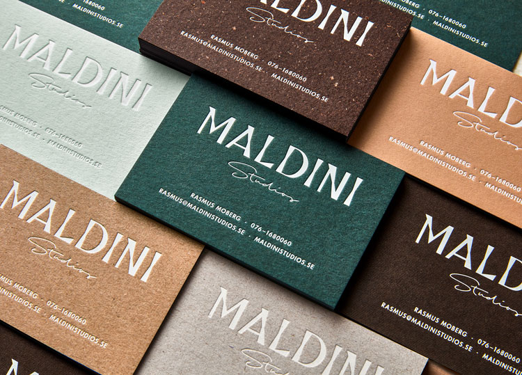
    Maldini2

    Texture is another trend to watch. Touch or haptic memory can have a strong impact on the human brain, helping to resonate on a deeper level than sight, sound or scent. Tap into haptic memory by using rich textures on your marketing material, such as wood grain, matte finish, debossing, raised ink, folds, and embossed detail. Flyers, postcards, business cards and other printed sales material that has an additional sensory element are ideal for helping to keep your brand front of mind.


    Meaningful mail campaigns.

    As direct mail begins to reach saturation point, campaigns need to be more meaningful than ever before in order to engage audiences. To see a genuine return on your direct mail investment, aim for engaging, personalised campaigns. Think about how you can resonate with a smaller percentage of your target audience rather than how you can send out bulk messages to a wider audience. This is the best way to drive results with flyers and other printed material mail drops.


    Soft signage.

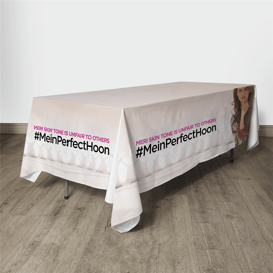
    99775_normal

    Incorporating banners, flags, tablecloths and other materials, soft signage is on the rise. This type of large format printing uses soft materials that are ideal for trade shows and POP displays. A number of these displays are integrating SEG (silicone edge graphics) and similar solutions, which are set to become more popular in the year ahead.


    While the Minuteman Press Pinetown team is more focused on providing our customers with the best level of quality and service than blindly following trends, we continue to find inspiration in the changing face of print marketing in Durban and surrounds. These 2018 printing trends are testament to how the industry continues to adapt, and we can’t wait to see what the future will bring.

  • The Different Types of Safety Shoes for Different Job Roles

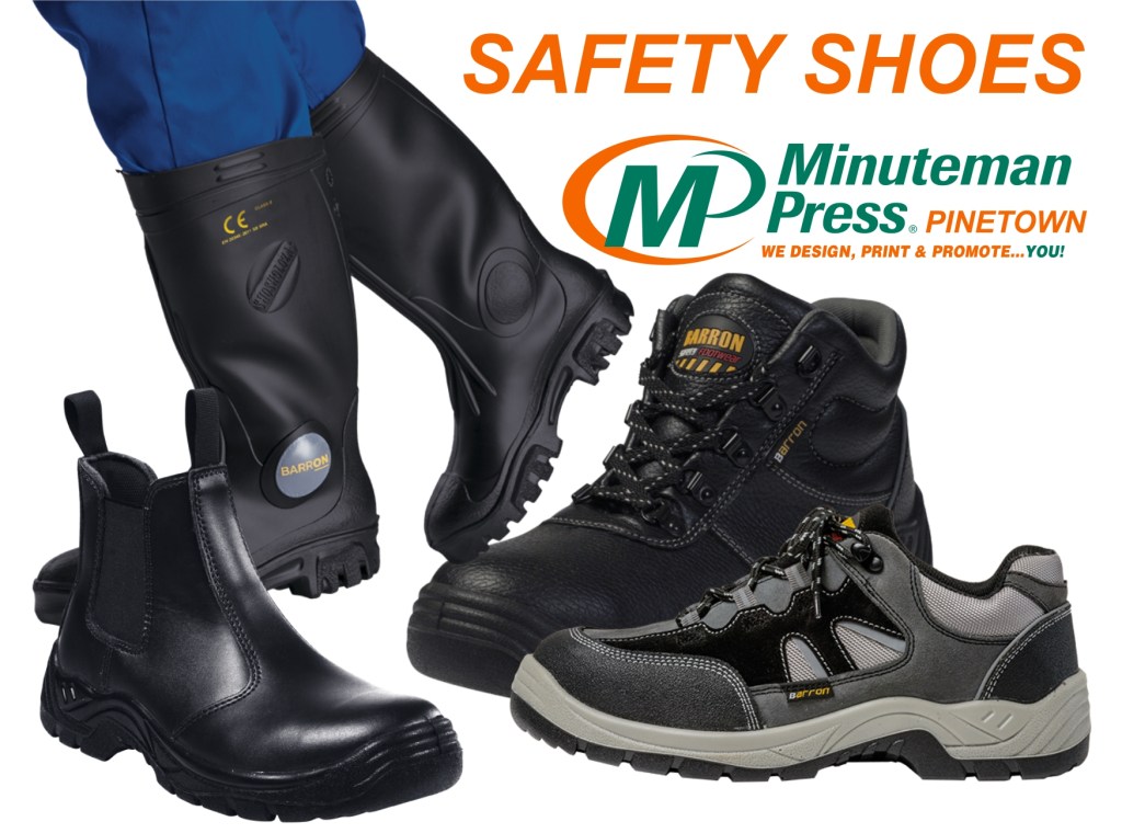
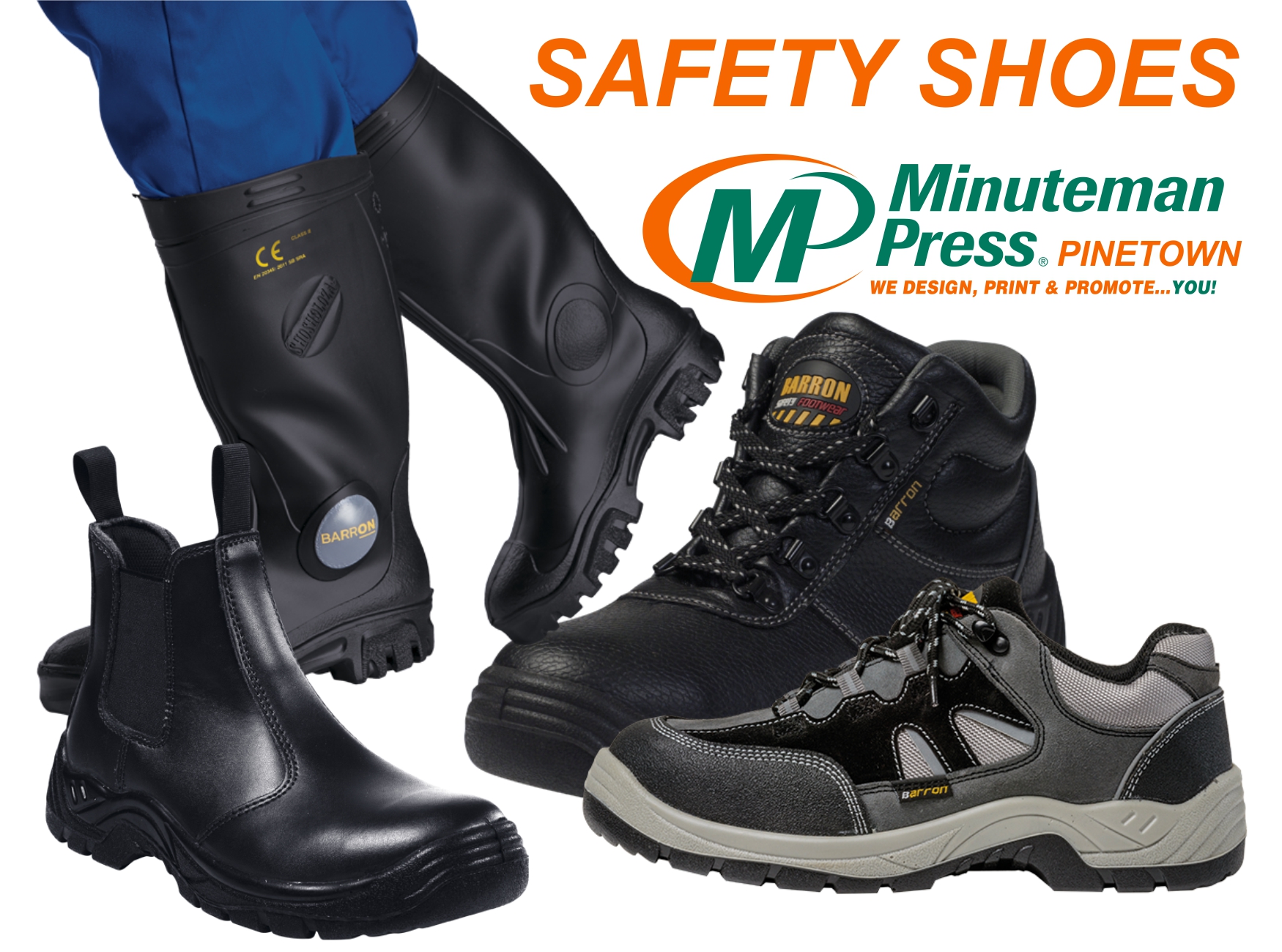
    SAFETY SHOES GOOGLE


    In the past, ‘safety boots’ conjured up images of unsightly black boots that were worn on construction sites. Corporate Barron clothing manufacturers have vastly upgraded the designs, look and feel of a number of safety shoes to make sure they’re not only more comfortable than ever before, but also much better looking. Here’s a brief overview of the different types of safety shoes that are available:


    • Safety-Toed Shoes

    People working in factories and other industrial environments are all too aware of the hazards that can arise from moving heavy equipment around. Safety-toed shoes have a special reinforced section that creates a hardened cap around the toe section of shoes.


    • Steel Insole Shoes

    Shoes with steel insoles are used to keep a person’s foot stabilised. If for example, a person has to push pedals on an industrial lifting equipment, the steel insole shoes can prevent the foot from shifting. This will help to avoid joint and bone problems that may arise from having your foot angled and pressured in certain positions.


    • Electric Hazard Shoes

    Some safety shoes have been designed to reduce the risk of an electric shock. Electrical hazards can pose many risks on site. So, if workers are moving between wiring, electrical devices and other high voltage equipment, then electric hazard shoes should be worn.


    Regardless of the types of hazards in your work environment, you need to make sure that your workers are wearing the appropriate safety boots to help them perform their jobs safely. Minuteman Press Pinetown is a Design, Printing and Marketing company that can offer you a wide variety of Barron safety boots.

  • Top Tips To Design A Winning Letterhead

    Lhead


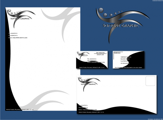
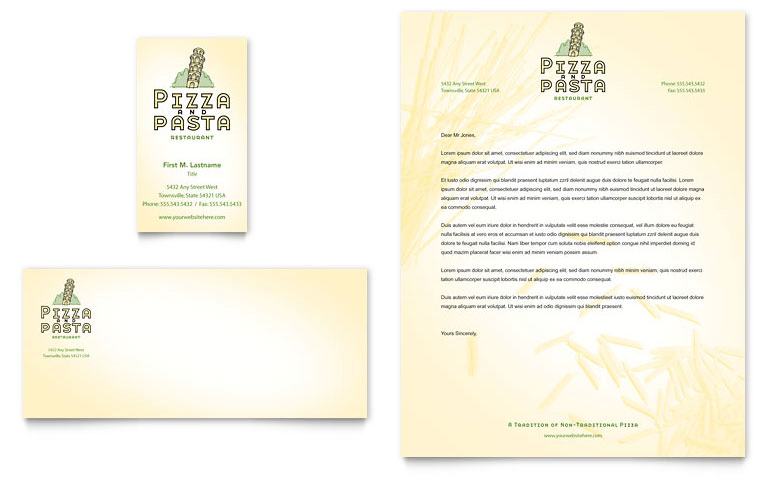
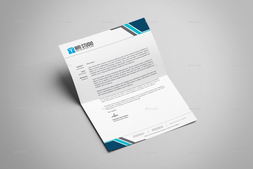
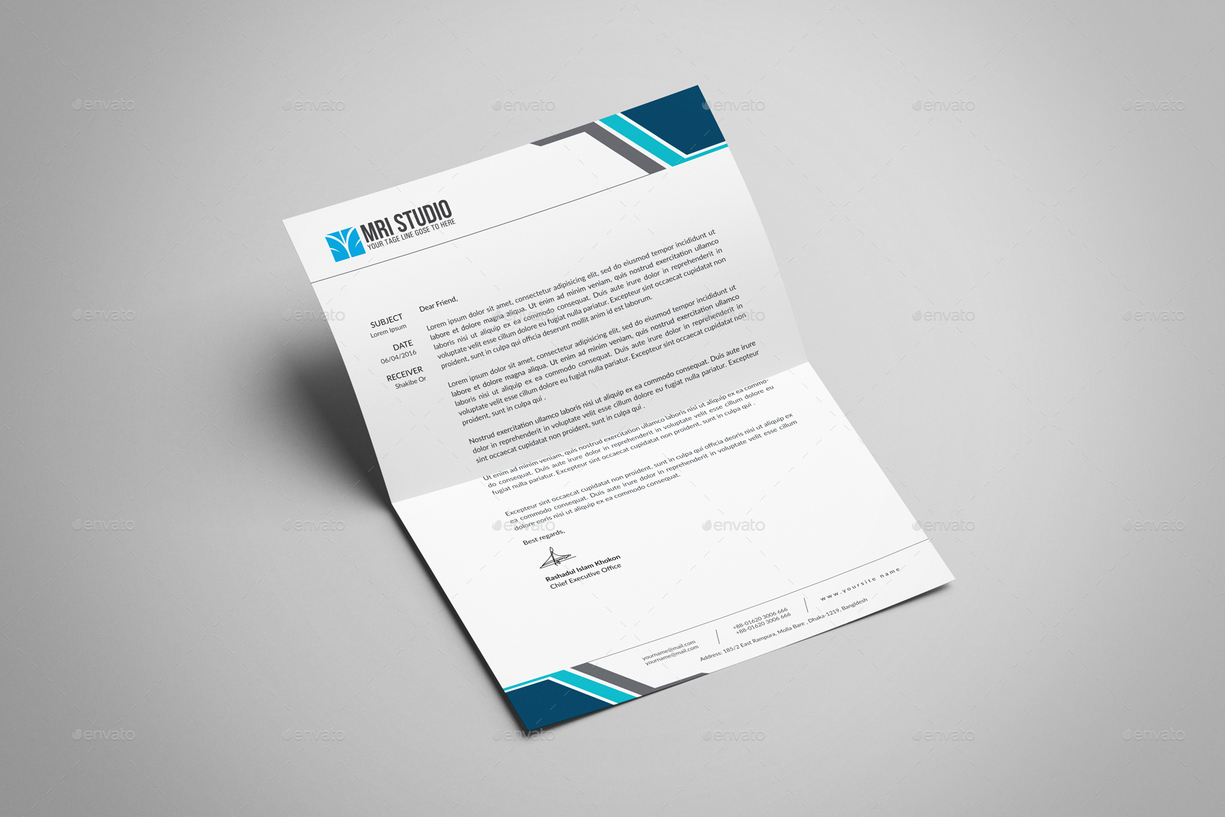
    Letterhead design is something of a lost art. In the days before email, letterheads were a great way to bring a brand together. Today, although things have evolved to include email as well, nothing can fully compete with a beautifully designed letterhead. To help you get the most from your letterheads, we have a few tips to share today. Keep reading to find out how to get the most from your letterhead design.


    How To Ensure The Best Letterhead Design


    Some tips to keep in mind when planning your letterheads include the following:


    Simple is always best.


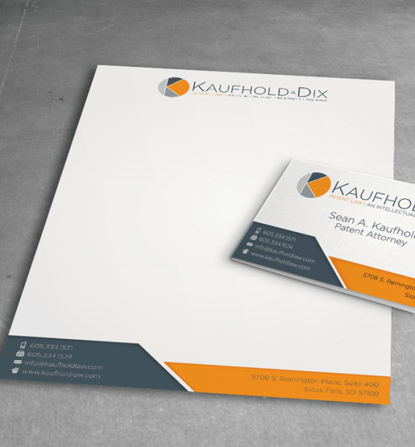
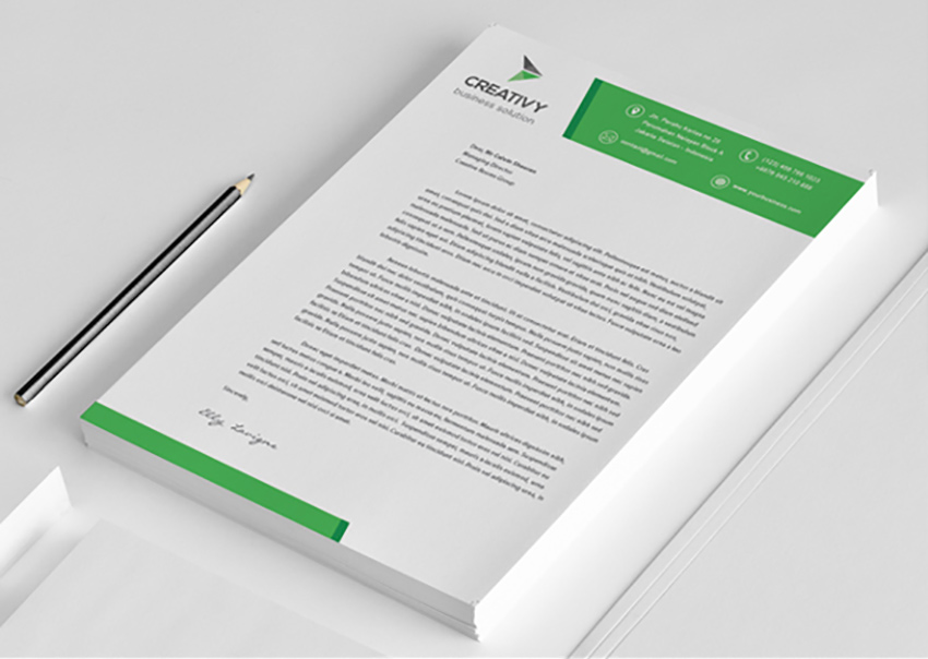
    Essentially, the only information that your letterhead needs to convey is your company logo and name, your title, your contact information, and possibly, a slogan or some type of visual detail. Less is usually more. Unless your letterhead is so minimal that it fades into the background, you should ideally have one that is simple enough to not take up too much space on the page. Play around with positioning to test designs. You could try a modern vertical letterhead, a border, a bottom centred letterhead or a contemporary design that showcases just your logo.

     lhead2

    Clutter often ruins the effect.


    The problem with adding too much to this design is that it very quickly starts to look cluttered. When you take up most of the page with an ornate top and bottom design, as well as a border, the effect is more chaotic than calming. This will make it harder for any letters to be read on the page without the eye wandering off the wording. An overly cluttered design can also look disorganised, aggressive or over the top, which is never good for your branding, either.

     lhead clut

    Excessive detail does not always print well.


    Yet another reason to keep your design simple is that too much detail will not always print properly. Many companies design their letterheads for printing at the office. Even if you invest in professional design and printing, it is always best to be on the safe side. Too many colours together can bleed, small details can be lost, and the effect can often be disjointed and haphazard, which are both no good as far as corporate stationery goes.


    Use colour wisely.

     lheads colour

    On the topic of colours, make sure that you use colour sparingly on this stationery. Too many colours used together can result in a loud, clashing letterhead that does not have the impact you are hoping to achieve. Decide on one or two colours, and bring those in subtly through smaller details. This will ensure that your documents can be easily printed without the risk of bleed. It will also ensure that your letterhead stays clean and professional-looking.

     lhead 2 col

    Brand cohesive is essential.


    Finally, always make sure that your stationery is designed with your brand in mind. Seeing stationery as a whole rather than looking only at your letterheads, presentation folders, envelopes, business cards, and promotional items individually. This will help you plan your stationery in a way that does not risk a disjointed brand.


    The best way to get the most from your letterheads is to invest in professional letterhead design in Durban. Minuteman Press Pinetown offers high quality corporate stationery that is conceptualised, designed and printed professionally. Get in touch with our team today for more information on letterhead design in KZN.

  • The Etiquette Of Giving A Business Card

    92825389

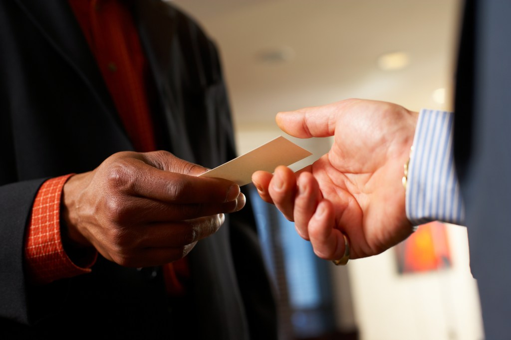
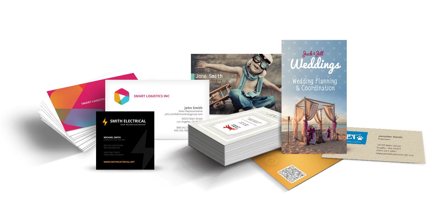
    Giving out your business card may seem like a simple enough thing. After all, how hard can it be to give someone a bit of paper? In reality, there are many unspoken etiquette rules involved in handing out cards. From not giving cards out to everyone you see to waiting to be asked before giving your card, keeping your cards up to date, adding a handwritten note and having enough cards on your person at any given time, we’ve put together a simple guide on business card etiquette.

    How to Hand Over Your Business Card

    Here are a few tips to consider before you hand out that business card.

    Make sure that all information on your card is up to date.

    Before you do anything else, make sure that your cards are up to date and accurate. Nothing is worse than handing out your card to a few people at a major event, only to realise later that your email address, phone number or role has changed. A general rule of thumb is to print cards in smaller runs if your business is likely to change at any point or you have a job that will involve a promotion at some stage. Whenever there any information on your original card changes, you will need to print new cards as soon as possible.

    Keep a decent stack of cards with you at all times.

    While it is never a good idea to print thousands of cards that you will likely never run out of any time in the century, you should keep a good selection with you at all times. One way to keep your cards close is to invest in a cardholder. As charmingly old-fashioned as these holders seem, they are extremely useful to keep a stack of cards with you whenever you are on the road, at conferences or at any other networking event. A beautiful card holder can also look impressive, as an added bonus.

    Business_Cards

    Don’t force your card on everyone you see.

    Even if you have a pile of cards with you, it does not mean that you should give them out to everyone you meet. Handing out your card to people uninvited is considered very rude in the corporate world. In fact, while you may think that you are proactively marketing your business, you are to all effect spamming people. Your card will almost certainly end up in a waste bin somewhere rather than being seen by the right people at the right time. That brings us to our next point…

    Give your card to those who show genuine interest.

    If you only give your card out to those who actually ask for it, there will be a far higher chance of that person genuinely wanting to get in touch. This is what real networking is all about. It is not forcing your contact details onto people, but rather about making meaningful connections. You can offer your card under certain circumstances. If you have been chatting a while, and your new connection is displaying interest, asking questions or asking you about pricing and other details, it will not be considered too rude to offer your card. When in doubt, however, it is safest to wait until your card is requested if you are not 100% sure.

    Add a personal note to the back of the card.

    Finally, a good way to hand your card over is to write a personal note relating to how you met your new contact. You can write this on the back of your card. Something as simple as, ‘hope you enjoyed XYZ Conference as much as I did!’ or ‘see you at the next trade show’ will help people remember you more easily. This also turns the exchange of cards into a meaningful connection, with the handwritten note adding a personal touch that will be remembered as much as a sleek card case and your respect of waiting to be asked to give your card. In business, it is all too often these thoughtful gestures that have the most impact.

    Looking for expertly designed and printed cards? Contact Minuteman Press Pinetown for professionally printed business cards in Durban and surrounds.
     

  • Discover the Benefits of Choosing Mechanic Overalls for Your Workshop

    overall


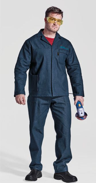
    Overalls tend to be preferred over pants as protective clothing for mechanics. Many mechanics who have learned the hard way (by ruining many items of clothing) opt for wearing overalls while working in the service bay.  At Minuteman Press in Pinetown, we are often tasked with the branding of workshop uniforms and have found that overalls are a firm favourite for those working in the industry.


    Top Benefits of Choosing Overalls as Protective Clothing in the Workshop (H2)


    Grease, grime, oil and chemicals need to be contended within the workshop. Mechanics must all work on the floor or crawl under vehicles to get things done. Below are a few top benefits of choosing overalls:


    • Overalls provide practical protection from shoulders to ankles in a one-piece unit.


    • Branded overalls turn mechanics into walking billboards for the business. They provide a great way for you to advertise your business and for your mechanics to feel part of a team (and proud of the brand).


    • The long sleeve overalls provide protection for the arms against fuel, chemicals and friction when having to work underneath vehicles.


    • Overalls are comfortable and cool to wear due to their design and loose fit. Many mechanics prefer a one-piece unit instead of having to wear pants, a belt and shirt.


    Speak with Your Local Printing Company About Branding Your Mechanic’s Overalls


    It is highly recommended that you speak with your local printing company, Minuteman Press in Pinetown, to discuss the many benefits of branded overalls and how to arrange such branding for your business. Protective clothing that you choose for your workforce can serve a dual-purpose:


    • Enjoy the protective element, and
    • Utilise the advertising opportunity.


    Bring your team together with branded overalls designed to benefit both your workforce and your business.


    To learn more about branding overalls and other promotional gear and items, contact us at Minuteman Press in Pinetown via email or telephone today.

  • JPG, GIF, TIFF – What Are These Things and What Do They Mean?

    jpg-png-gif-bmp-tiff-mega-cheat-sheet-cover


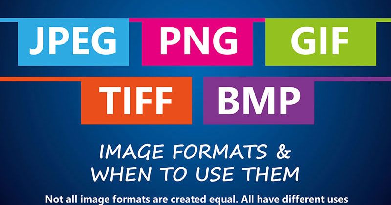
    Image file formats can be confusing at the best of times. While JPG, GIF, and TIFF may all sound much the same to you, there are a number of unique differences to each format that can affect the quality of your printed material. When you need to send files through to your printing services provider, it is essential that your files are in the correct format.


    To help you better understand each format to see which is best for your project, we have put together a mini guide to image file formats. We hope that this guide clears up any confusion, helping you get the very best possible results once your projects go to print.


    How Do Image File Formats Work?


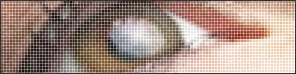
    Before we compare the main image file formats, it is good to know how digital images work. Simply put, image formats are used to standardise the way that images are stored and organised. Image files contain data that affects the way that they are displayed in print and on computer screens. Images are comprised of a grid of pixels, each containing a number of bits that determine its colour, equal to the colour depth of the device that is displaying the image.

     img_pixel-grid

    A Guide to Image File Formats


    Now that we have a better understanding of image file formats, which are the most commonly used formats?


    JPEG/JPG – Joint Photographic Experts Group


    JPEGs or JPGs are one of the most commonly used image files. The quality of these files decreases as the file size decreases. That means that a very large size file may look good, but a reduced version may not look as good. For printing, this is the worst format to use. It works better for web-based projects. Make sure you consider the resolution as well as the file size if you want a decent looking result from JPGs.


    GIF – Graphics Interchange Format


    Best known in their animated form, which are used all over the internet, GIF files can also be static images. In their simplest form, GIFs are comprised of up to 256 RGB colours. Because they are made up of a limited number of colours, they often have a far smaller file size. For fast loading websites, this file is useful. This format can be useful for simple graphics with only a few colours, such as logos, shapes, and diagrams. Quality is lost when multiple colours are used, however.


    TIFF/TIF – Tagged Image File


    TIFs are large files that do not lose quality. This format is typically used for printing photographs and other high resolution or large file size documents. Using this type of file for web based projects is never advised, as it will result in extremely slow loading web pages.


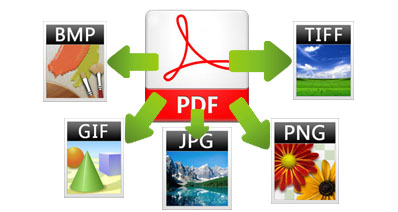
    Note – PDF (an original print-ready vector artwork in high quality) can be saved as any of the image file types, however images saved as a PDF will still just be an image and therefore will not be print-ready, high quality vector as required by your printer. You would need to supply a print ready artwork file in PDF or recreate the design into vector/PDF format.

    convert-pdf-to-image

    If you are ever unsure about the best format for your project, it is always a good idea to ask an expert. Get in touch with the Minuteman Press Pinetown team today with any questions you may have on image file formats and printing. We will help you find the best format for your printed marketing material in Durban and surrounds.
  • 2018 Graphic Design Trends

    2018 Graphic Design Trends

    graphic design trends

    As we get closer to the new year, we can’t wait to see which graphic design trends lead the way in 2018. Each year, design trends play a subtle yet important role in marketing. Some trends come and go, while others continue to evolve each year in new and inspiring ways.


    While we never advise following any trend blindly, it can be useful to stay abreast of trends to get inspiration for the year ahead. Keep reading to find out which 2018 graphic design trends are worth noting.


    Graphic Design Trends to Watch in 2018


    Some of our favourite graphic design trends to watch in the new year include the following:


    ·         Double exposure. This trend has stayed current for a number of years. Next year, we are sure to see even more use of double exposure in brochures, business cards, flyers, posters, and various other materials. There are many ways to bring double exposure elements into your designs. One way is to use alternating shapes to add contrast. You could also use images in different colours to further add impact. However you use it, this look is bold, interesting and eye-catching.

     double exposure

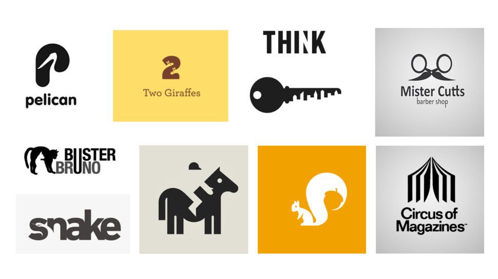
    ·         Negative space. Negative space is very similar to double exposure, with a few key differences. Rather than juxtaposing two images together in one design, spacing is used in a way that creates brand new designs from existing elements. This can be especially powerful when used in logo design and poster design. Choose your fonts wisely to get the full effect of this trend. On the topic of fonts, there are some noteworthy trends in typography as well in 2018…

     negative space

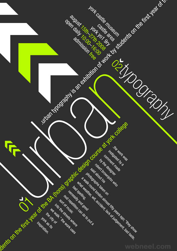
    ·         Creative typography. Typography remains one of the biggest design trends, year on year. In 2018, we can expect to see a number of interesting, creative font trends. One of the biggest trends will be handwritten fonts, which work especially well with hand-drawn illustrations. This look is ideal for brands wanting to add a personal touch to marketing material. It is light-hearted, fun and quirky, while also being fresh and original. Depending on your goals, you can use creative fonts in brochures, posters, flyers, door hangers, and various other material.

     typography

    ·         Artistic illustration. Continuing the hand-drawn effect, illustration continues to be used in a range of posters, logos, business cards, and brochures. One of a kind graphics can be a fresh way to add impact to your branding material in a way that is approachable and memorable. Illustration can be layered over photographs, integrated within or around fonts or even repeated to create interesting backgrounds.

     artistic illustrataion

    ·         Colour gradients. Next year, it is time to say goodbye to flat colour, and hello to 3D colour and other visual effects. Colour gradients are one of the top colour trends to watch in 2018. This trend will be used in a range of ways, from website backgrounds all the way to printed brochures, posters, business cards, and other material. If you plan to use this trend, be sure to choose your colour gradients wisely so that they blend into each other without clashing.

     gradient

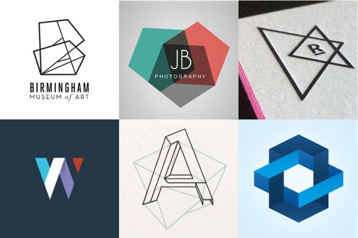
    ·         Geometric shapes. Geometric shapes are also on the rise. These can be found in logo designs, as well as backgrounds, brochure layouts, posters, and various other printed sales material. Use this trend sparingly so that you are able to highlight information rather than distract the eye. When used in moderation, geometric shapes add a touch of retro style to your material. When used too much, however, the result will be more distracting than interesting.

     geometric

    Looking for a way to keep your marketing material on trend? Get in touch with the Minuteman Press Pinetown team for the very best in graphic design trends in Durban and surrounds.
     

  • 5 Top Tips for Annual Reports That Get Attention

    annual_reports_header2_4.23.14


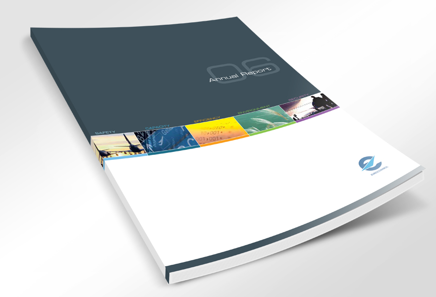
     How can you be sure that your annual reports get attention for all the right reasons? This type of document is a powerful promotional tool that helps you celebrate your successes, attract new customers and appease stakeholders. As such, it is imperative that your reports are produced to the highest quality possible. A rushed, poorly printed or badly designed report can end up undoing all the hard work you have completed over the course of the financial year. A professionally produced report, on the other hand, allows you to show your customers and stakeholders what you have achieved in a way that encourages future business.
     

    To help you ensure that your annual reports hit the mark, we have put together a few tips to keep in mind. These tips will help you plan, design and print the very best reports for your business.


    How to Create Enticing Annual Reports


    Some things to consider when planning annual reports for your company include the following:


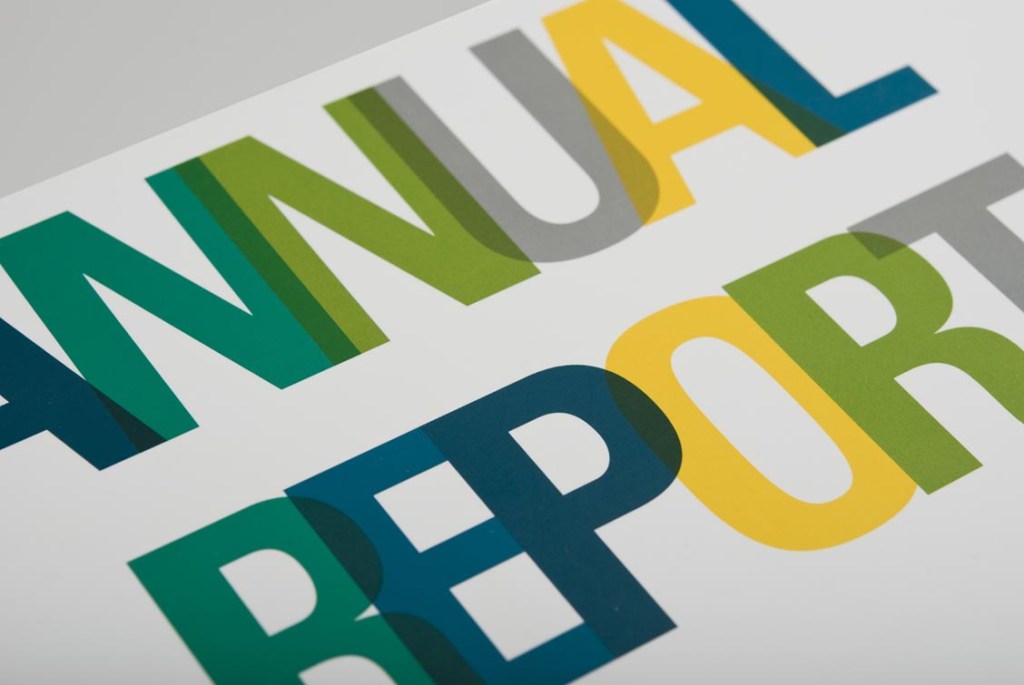
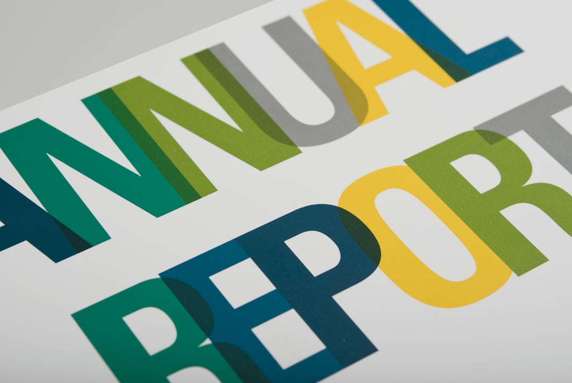
    ·         Choose fonts carefully. Fonts can make all the difference to how easily your reports are read. While some fonts are suitable for corporate documents, others should never be used in an important document such as a stakeholder report. Use clear open fonts rather than fancy scripts that may not be as easy to ready when your reports are printed. Remember that the final printed document may look different to the document you are working on from your computer. To get an idea of how to use fonts correctly, consider the tips on the importance of using the right font.

     annual repprt

    ·         Make sure it is highly visual. Choose your images and colours carefully, too. Visuals are essential with this type of document. You will be able to include tables, graphs, and infographics to support your data, but make sure that you don’t try to cram in every single possible visual. Instead, aim for a balance between text, headers, and imagery. This will make your report interesting to read, with a structure that can be easily absorbed without the eye glazing over from blocks of solid text.


    ·         Streamline your narrative. On that note, it is vital to have a clearly outlined narrative. What is your primary goal for your report? Are up updating shareholders at an end of year meeting? Do you plan to use this report to pitch new clients? What are the main points you want to focus on in the report? There is no point to having an abundance of data if it has no direct correlation to your goals.


    ·         Invest in professional design. The last thing you want stakeholders to think is that you could not be bothered to create a quality report. While you may have plenty of ideas on how you want your report to look, make sure that you do not attempt to do everything yourself. There are a number of risks involved in designing your own reports. Unless you have an in-house design team that has ample experience and expertise in corporate material and design, you may end up losing stakeholders if your report looks unprofessional or amateur.

     annual

    ·         Print reports professionally. That also means investing in professional printing as well. You could have the best report design in the world, only to lose respect from a poor quality print result. Choose a trusted printer who is able to print company reports in Durban using the best possible paper, ink, and process. This will ensure that your report is polished, flawless and ready to do its job.


    Ready to find out more about printed corporate materials? We offer design and printing services to suit your needs and budget. Contact Minuteman Press Pinetown for a quote on annual company reports in Durban.